ANDROID JELLY BEAN 4.1
We've all seen the new Google Nexus 7 - but what about the
new phone and tablet software that's coming your way?
We've spent some time with the new version of Android -
dubbed Android 4.1 or Android Jelly Bean to its friends - and while it's not a
massive overhaul by any means we've still taken a good look at the improvements.
Project Butter
The first thing we wanted to try out was the speed of the
interface, as Project Butter is supposed to really push things along. We'll lay
it out now: we were using a non-final version of Google's Nexus 7 tablet as a
trial device, so it may not be the perfect experience.
However, the under the finger response improvements were
definitely tangible; we noticed an much faster response on unlocking, for
instance, than we're usually accustomed to on the likes of the Asus Transformer
Prime, which is rocking the same Tegra 3 CPU architecture.
The idea is that the CPU, GPU and display all 'lock-step',
and while this isn't necessarily the most ground-breaking feature of the whole
OS, it will make future Android devices that much more impressive when poked -
and that's a Good Thing.
Interface
When it comes to moving things around the home screen,
Google really was true to its word - it's so much easier to mess around with
widgets now.
However, let's not get ahead of ourselves - Google giving
users of Jelly Bean the ability to move icons around when a widget is chucked
on top of them is not new; just look at the Motorola Razr if you don't believe
us.
But the interface is very neat in action, and especially
seeing the widgets resize themselves when you plop them down in a space they
can't fit - we can't tell you the amount of times this has gone wrong for us
and caused untold frustration.
Flicking icons and widgets off the top of the screen feels
highly intuitive as well, although very PalmOS like - we're sure there's some
litigation to be had in there somewhere.
Chrome browser
Android 4.1 will generally come with the Chrome internet
browser pre-installed, which is another Good Thing in our books, as it means
more cooperation across the desktop and mobile phone and generally leads to
better functionality on the phone.
On the Google Nexus 7, the browser is as good as we've come
to expect - namely, fast and slick operation when flicking through sites.
We did notice copious amounts of slowdown on more that one
occasion - but the ease of which we could flick between tabs at the top of the
screen, coupled with the fact we were faced with a pre-prodcuction unit, soon
allayed those issues.
Google Now
Now here's an interesting one - the idea of making search
just that much more intuitive using the power of your voice.
You have to hold down the home button to activate it - which
begs the question how this will work when it comes to phones like the Samsung
Galaxy S3, which uses the same action to call up the task manager interface.
However,the interface is neat, and you can simply turn on
the voice recogntion by saying Google (cool, but pointless as you have to touch
the device to activate the app) or touching the voice icon.
In use, you still have to be careful what you say. Asking
'How old is Barack Obama?' will give you the relevant card with all his details
(not ALL of them, it's not got his email address or anything) but saying 'show
me pictures of the Queen' won't give you anything back.
However, stating: 'pictures of the queen' will get you up
and running with an image search. And here's where the plan falls down
slightly: if you need to tailor your speech to make it work, something like
this need to be more intuitive.
The voice recognition was generally very good though, and you
could sense the speed update to word guessing thanks when put in offline mode.
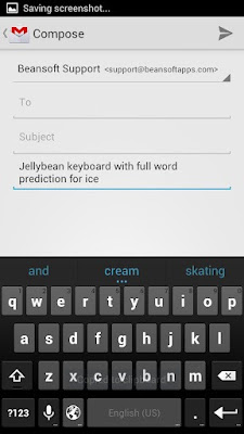
The typing was also noticeably better when using the
keyboard - we've never been totally unimpressed with Google's overall efforts
here, but the next word prediction particularly caught our eye - it was
Swiftkey levels of intuition, but it still managed to help us on more than one
occasion.
Notifications
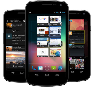
The last area we want to talk about is the notifications
bar, which has been upgraded for this Android 4.1 release. It's a nifty change,
as it's got more information crammed into the drag-down menu than ever before.
For instance, if you're on a call, you can hang it up from
the drop down menu now - although this has been a feature of Samsung's TouchWiz
for a while.
But there's so much more - you can snooze a meeting, be told
when to leave for an appointment based on your location and search history
collated by Google, and even send a message to tell people you're going to be
late with a quick tap.
We couldn't properly try this whole system without having
media on the device to play music, or a boatload of other apps to interact with
the notifications bar - but the notion of simply double-finger dragging down on
any alert to expand it worked really well, and this is an update people will
really like.
Early verdict
Google has made something decent here - the chance to get
some cool features for your phone or tablet, but nothing that ground breaking
that you'll miss it if you have to wait for your brand to roll it out.
The problem with the Ice Cream Sandwich delays was users
were aware their phone would discernably different post update - here, Google
has focused on a few new features and made the UI ostensibly the same.
A good move or one that didn't deserve such a hurrah? We'll
side with the former argument - after all, this is still new functionality that
doesn't cost you a penny, and with it comes extra reasons to buy an Android
device.
You won't go out of your way to get Android 4.1, but when it
does land you'll likely notice a refreshing boost throughout your handset.
Hope you like this review....... Please share and comment...


No comments:
Post a Comment